Reducing critical incident time, where every minute counts, and the sales that followed.
Speeding up the most critical minutes in incident response.
FireHydrant helps engineering teams respond to incidents, but in high-pressure moments, even small inefficiencies create costly delays. I redesigned the Runbooks experience to help teams move faster, reduce errors, and operate with confidence during critical incidents.
Overview
Role: Senior UX Designer
Team: Head of Product Management, Lead Engineer, IC Engineers
Scope: Runbooks experience for incident response
Goal: Reduce response time and improve consistency during incidents
Impact: Customers saved 30–90 minutes per incident and increased adoption contributed to new contracts
The situation
In incident management, the first few minutes determine the outcome. Teams need to coordinate quickly, execute the right steps, and avoid mistakes under pressure. But most teams relied on manual workflows, tribal knowledge, and inconsistent processes, leading to slower response times, confusion, and increased downtime.
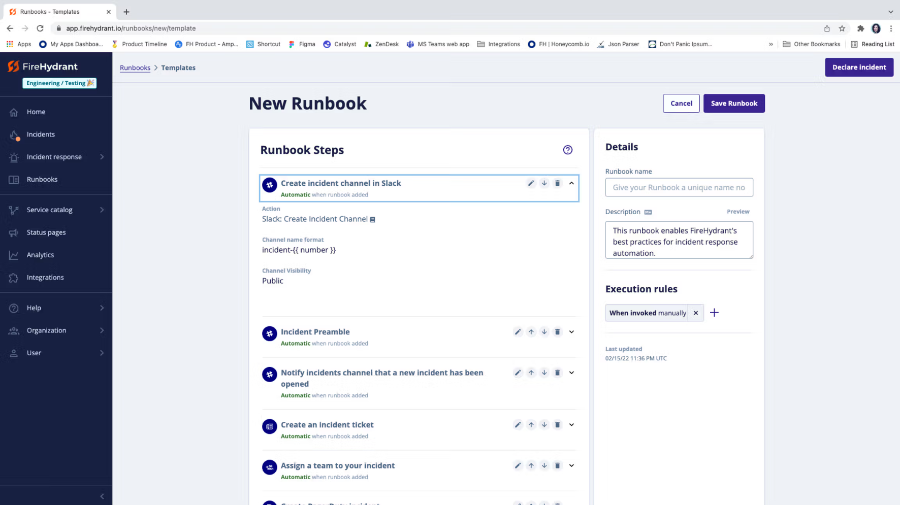
Runbooks were meant to solve this by giving teams a structured, repeatable way to respond to an incident. In practice, new customers weren't seeing the value. Adoption was stalling before teams ever got the benefit.
The problems
Underneath the UI issues was a deeper problem: teams didn't know what they wanted to do, and didn't know how to use the page to do it.
The issue wasn’t just tooling, it was execution under pressure. Through conversations with current and prospective customers, we surfaced four recurring pain points:
-
Customers were intimidated by the amount of work required, and starting from an empty screen made the first step unclear.
-
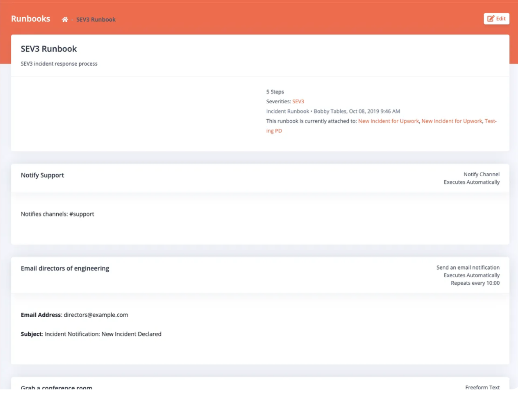
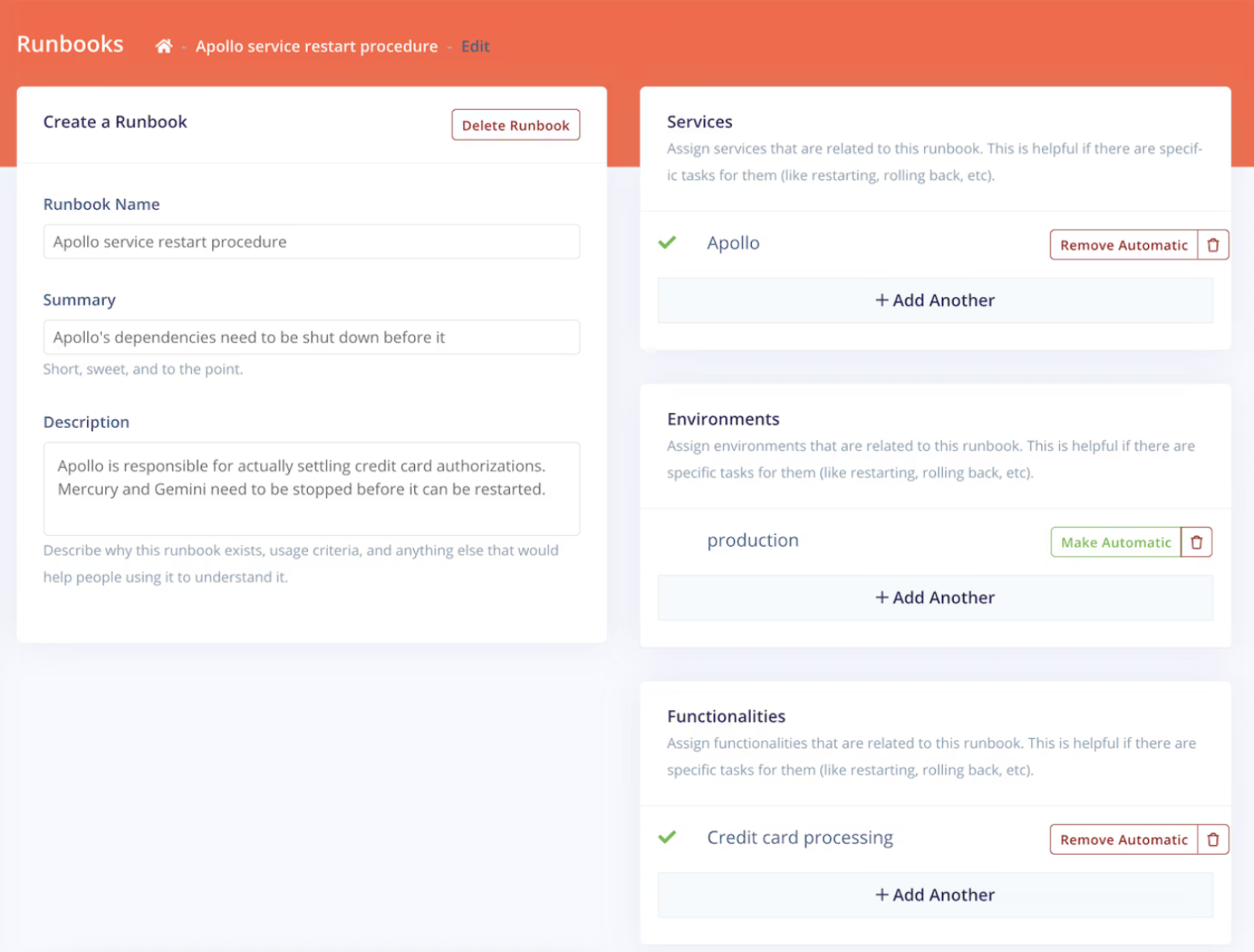
Heavy manual work, especially duplicating a runbook to reuse and adjust, which required a lot of window-switching and often introduced copy errors.
-
The only way to see what a variable actually output was to run a real incident, sometimes 10 incidents just to test one step.
-
Customers didn't know how to think about them conceptually and offer no assistance or suggestions along the way.
Why this was hard
The experience needed to hold up in high-stress, real-time environments.
We had to balance structure against flexibility, too much of either worked against teams.
Different teams ran different incident types and workflows; there was no single "correct" process to design for.
The stakes of a design misstep were higher than usual: a confusing flow doesn't just frustrate a user, it slows down an active incident.
We weren’t just designing a workflow tool, we were designing for behavior under pressure.
Grounding the Work in Business Impact
Before jumping to solutions, I worked with internal stakeholders to align on why fixing this mattered to the business, not just to the user. Anchoring the redesign in these goals kept the team focused on outcomes that mattered beyond the interface itself.
-
Confusing setup was slowing adoption and configuration with current customers, and scaring off new signups.
-
Customers who got scared off by the perceived setup effort were deprioritizing FireHydrant before they ever saw value.
-
The FireHydrant team didn't have the bandwidth to spend hours per customer manually walking them through runbook setup.
-
Customers had incident processes of their own but still looked to FireHydrant to tell them how to translate that process into the product.
-
If customer champions failed at setting up runbooks, it reflected poorly on both them internally and on FireHydrant as the tool they'd chosen.
Strategy
We aligned around a core principle:
Reduce cognitive load during incidents by making the right actions obvious and easy to execute.
This led to three priorities:
Clarity in execution
Flexible but structured workflows
Automation of repetitive steps
Reduce cognitive load during incidents by making the right actions obvious and easy to execute.
Mapping the current experience
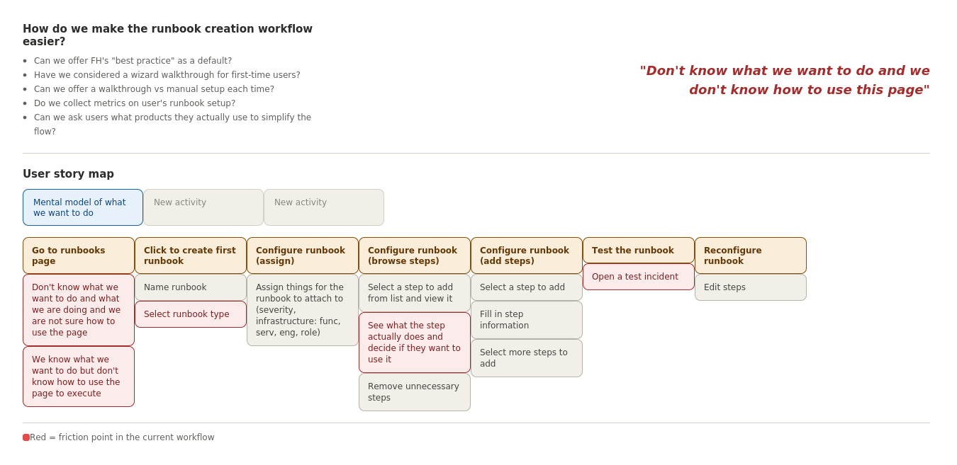
To see exactly where the pain points occurred, I built a journey map of the existing runbook creation flow, from landing on the Runbooks page, through configuring and testing, to reconfiguring after an incident. Mapping it against the actual pain points made two root issues visible:
"Don't know what we want to do and don't know how to use this page." Users lacked both the mental model and the interface cues to get started.
Friction points clustered heavily around configuration (assigning steps, filling in step information) and testing (only being able to validate a step by running a live incident).
This reframed the problem: it wasn't only about simplifying screens, it was about giving users a starting point that matched how they already thought about incident response.
Solution ideas: brainstorming with the team
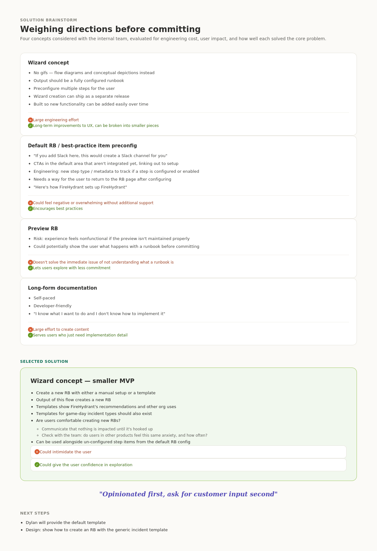
I ran a brainstorm with the internal team to evaluate several directions before committing to an approach:
Wizard concept: a guided flow using flow diagrams (no walls of text) that outputs a fully configured runbook, with the option to preconfigure multiple steps at once. Strongest long-term fit for the UX, though a larger engineering lift; we scoped a smaller MVP version of the wizard to de-risk it.
Default runbook / best-practice item pre-configuration: surfacing suggestions like "if you add Slack here, this creates a Slack channel for you," with clear indicators of whether a step was configured or enabled. Risk: could feel opinionated or overwhelming without enough supporting explanation; upside: actively encourages best practices.
Preview runbook: showing users what a runbook does before they commit to building it. Helpful, but on its own it didn't solve the core problem of users not understanding what a runbook was in the first place.
Long-form documentation: self-paced, developer-friendly reference content for users who knew what they wanted but not how to implement it. Useful as a supplement, but costly to produce and not a fix for the onboarding moment itself.
We selected the smaller wizard MVP as the primary direction, built around one guiding principle: be opinionated first, and ask for customer input second. Rather than starting users on a blank page, the flow would offer a pre-built or templated runbook (including FireHydrant's own recommendations) and let users adjust from there.
From journey map to wireframe
With the direction set, we mapped a proposed future-state journey, landing page, runbook creation, template selection, preview, and incident execution and broke the work into shippable iterations rather than one large release.
Iteration one focused on the entry point: giving users a clear first decision instead of an empty editor.
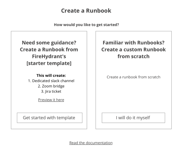
That became the first wireframe: a "Create a Runbook" screen offering two clear paths:
Need some guidance? Start from FireHydrant's starter template, which automatically creates a dedicated Slack channel, a Zoom bridge, and a Jira ticket — with a preview available before committing.
Familiar with Runbooks? Build a custom runbook from scratch.
This single decision point addressed the "don't know what we want to do" problem directly: users no longer had to hold the entire mental model in their head before taking a first step.
How I led the work
Translated ambiguous incident-response pain points into clear, scoped design problems.
Focused on user behavior under pressure, not just feature-level design.
Facilitated stakeholder alignment early, connecting the redesign to concrete business goals (adoption, time-to-value, team bandwidth, trust).
Ran cross-functional brainstorms to weigh multiple solution directions and their tradeoffs before committing.
Broke the roadmap into iterations so engineering could ship and validate incrementally, starting with a working prototype to test with current and prospective customers.
The tested and early design (below)
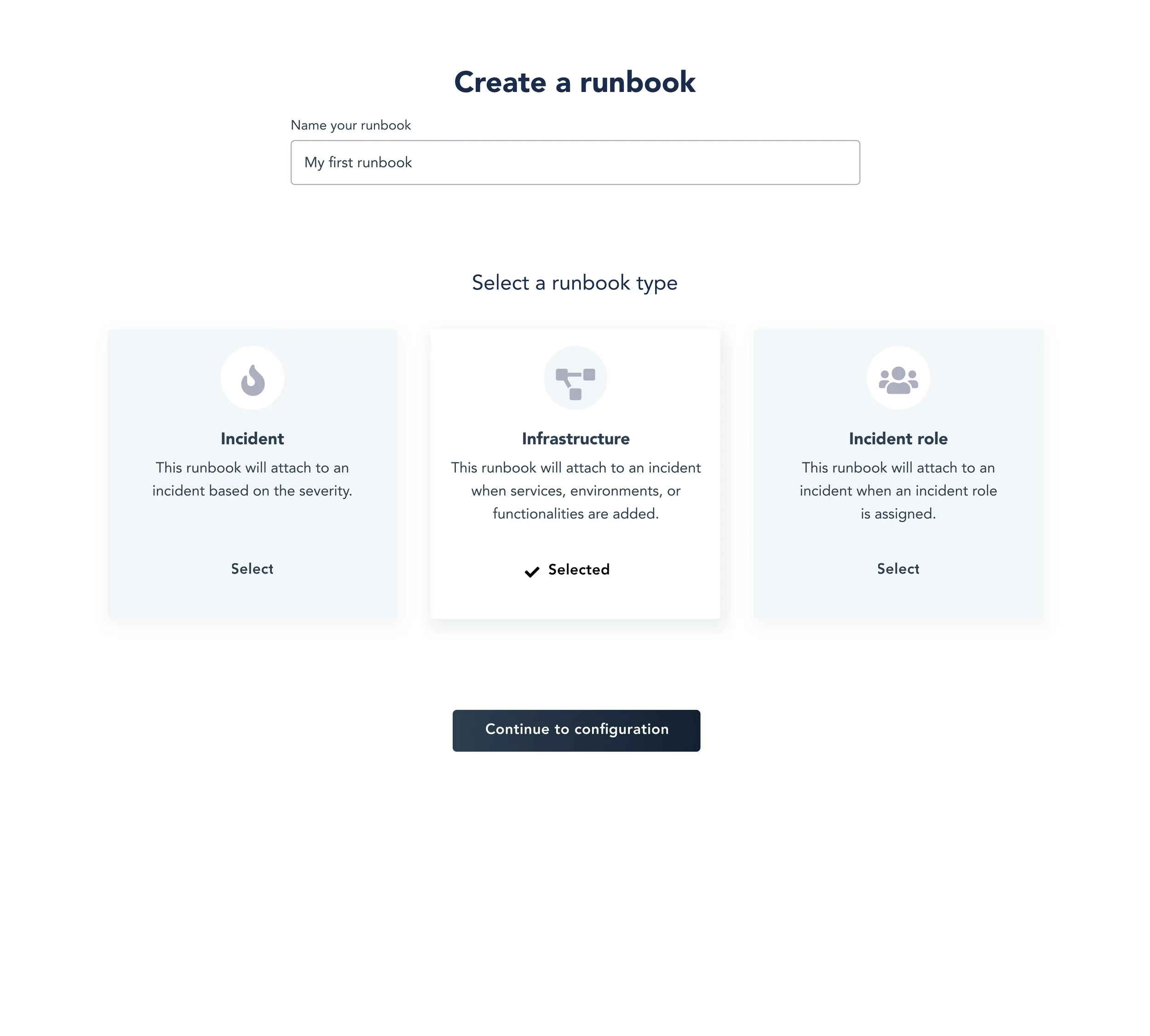
Wizard, choose a template to start
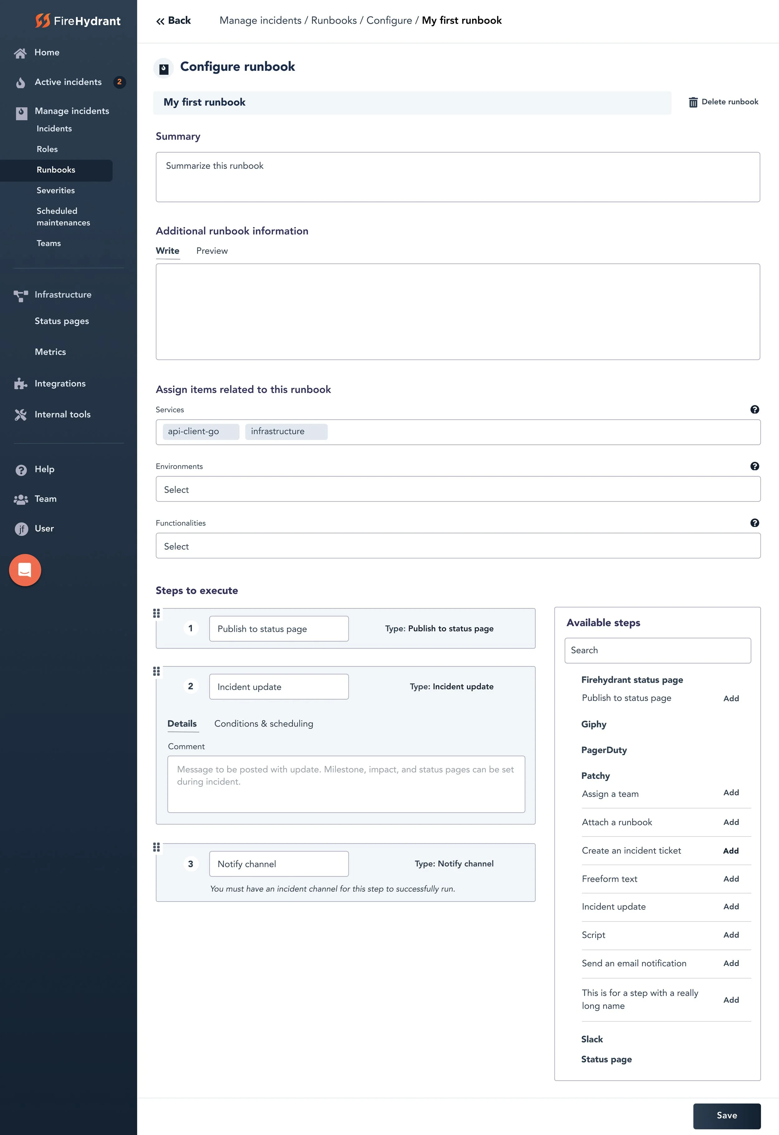
Template with pre-filled steps
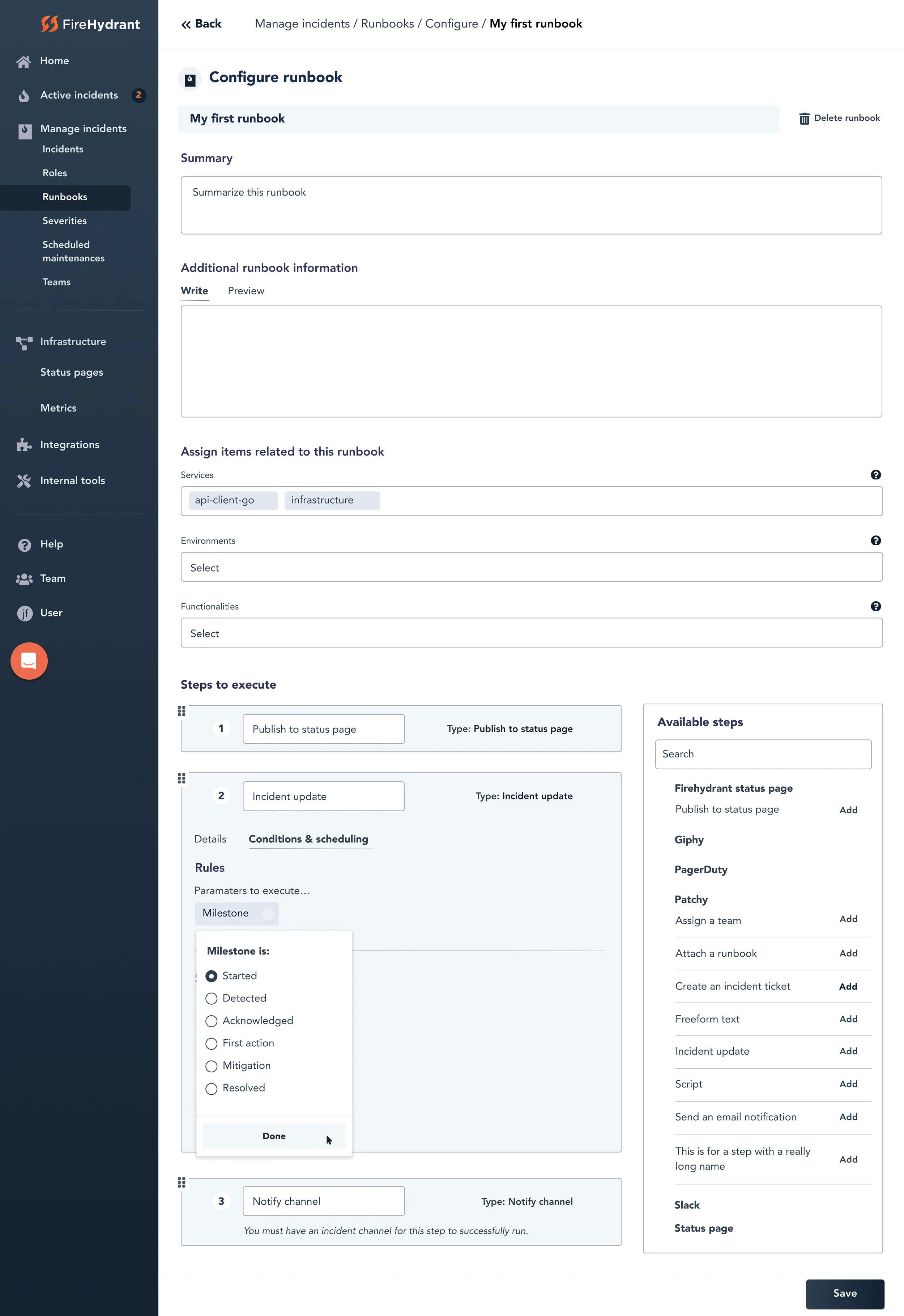
Add and edit steps
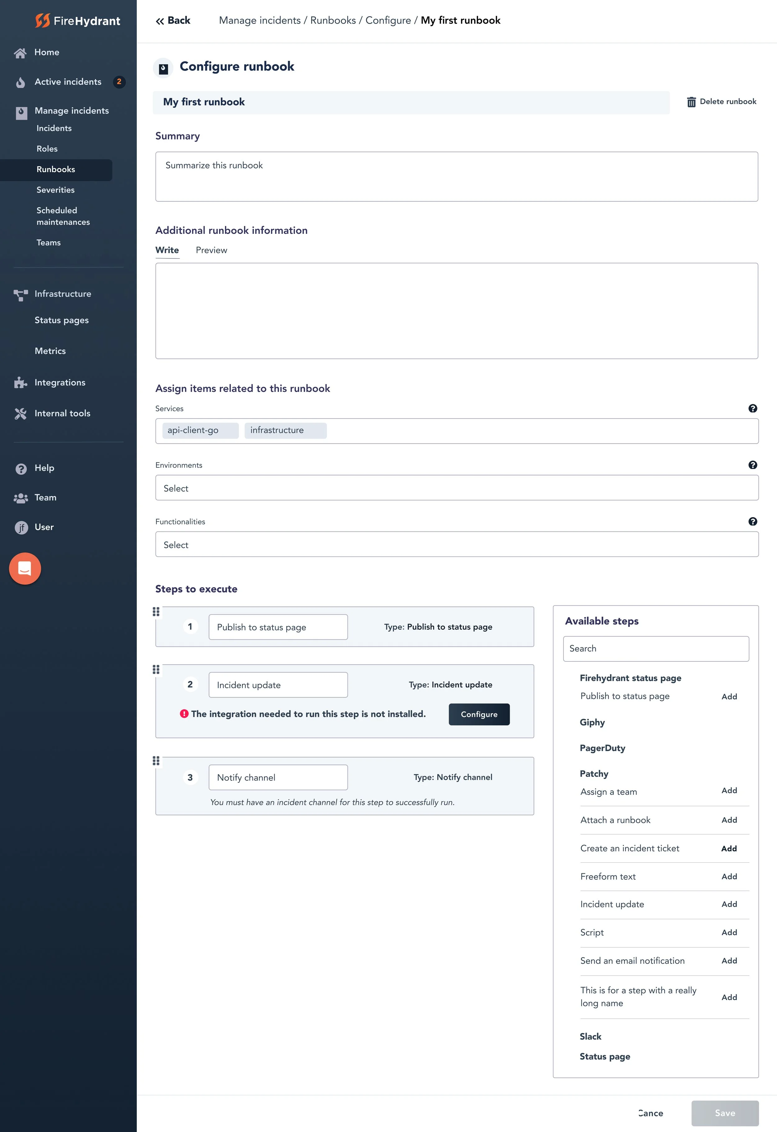
Error handling and recovery
Outcomes
Customers saved 30–90 minutes per incident.
Faster, more consistent incident response across teams.
Increased customer adoption, which contributed to new contract growth.
Most importantly, teams could respond to incidents with confidence instead of confusion.
What this demonstrates
Designing for high-stakes, real-time environments where mistakes compound quickly.
Turning a long list of qualitative pain points into a structured, prioritized problem space.
Balancing flexibility with usability, and structure with speed.
Leading a process — stakeholder alignment, research synthesis, journey mapping, solution brainstorming, wireframing — not just producing a final screen.
Final takeaway
This wasn’t just a UI improvement, it was a performance improvement.
By reducing cognitive load and introducing structured, opinionated-but-flexible workflows, I helped teams move faster and make better decisions when it mattered most.
The end design
After a few more iterations and adoption of the design system