
Enhancing Bulk Assignment Emails
Turning a low-trust notification system into a high-engagement product touchpoint.
Trainual’s bulk assignment emails were a critical touchpoint—but they weren’t working. Users ignored them, distrusted them, or felt overwhelmed by them. I led an effort to redesign the experience to improve clarity, trust, and engagement.

Overview
Role: Lead Product Designer
Scope: Bulk assignment email notifications
Goal: Increase engagement and product usage
Impact: Exceeded click-through goals by 30%, driving increased logins and training completion
The Situation
Bulk assignment emails were meant to drive users back into the product to complete training.
But in reality:
Users ignored or deleted them without opening
Emails felt cluttered and inconsistent
Engagement and downstream activity were low
This created a gap between intended behavior (completing employee training) and actual behavior (employee training disengagement).
The Problem
The issue wasn’t just visual—it was a breakdown in trust and usefulness.
1. Low Clarity
Users couldn’t easily tell:
What the email was about
Whether it referred to one task or many
2. Poor Readability & Accessibility
Small text
Hard-to-scan layouts
Inconsistent formatting
3. Notification Fatigue
Redundant emails
Too many similar messages
4. Mismatched Expectations
CTAs led to unexpected destinations to do the training
Emails didn’t provide enough value to justify the interruption
5. Loss of Trust
Inconsistent design made emails feel like spam
Why This Was Hard
Emails had to work across devices, modes, and email clients
Needed to balance visibility vs. notification fatigue
Required alignment between content, design, and product behavior
Success depended on both email interaction AND downstream product usage

Are these emails helpful?

More emails
Strategy
We aligned on a core hypothesis:
If bulk emails are clearer, more trustworthy, and more actionable, users will re-engage with training and complete assigned training work.
This led to three priorities:
Improve clarity and usability
Rebuild trust through consistency
Reduce noise while increasing value

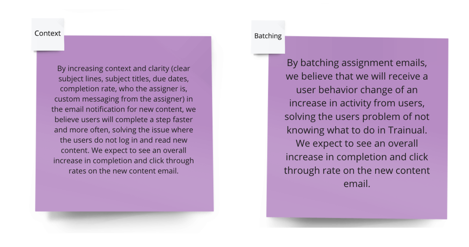
Hypothesis Framework and Testing:
We created two hypotheses to align on the expected impact of the design changes for our users and our business goals, helping us focus on key areas to test and make data-driven decisions.
By implementing [specific design changes], we believe [user behavior] will improve, addressing [identified problem]. We expect to see [measurable impact].
Key Decisions
1. Simplify and Clarify the Message
We redesigned emails to clearly communicate:
What action is required
How many items are assigned
Why it matters
Why: Users shouldn’t have to interpret the email
2. Reduce Redundant Notifications
We streamlined when and how emails were sent.
Why: More emails ≠ more engagement
Tradeoff: Fewer touchpoints, but higher quality
3. Align CTAs with User Expectations
We ensured every CTA led to the correct, expected destination.
Why: Broken expectations erode trust quickly
4. Design for Readability and Accessibility
We improved:
Typography
Layout hierarchy
Mobile responsiveness
Dark mode compatibility
Why: Emails need to be instantly scannable in any environment
5. Establish Visual Consistency
We aligned design patterns across all email touchpoints.
Why:
Consistency builds credibility and trust
How I Led the Work
Synthesized user feedback into clear problem areas
Defined hypotheses tied to business and user outcomes
Conducted competitive analysis to identify best practices
Led iterative design, testing, and refinement
Collaborated with cross-functional partners to ensure alignment
Rather than jumping to solutions, I focused on validating what would actually change user behavior.
Competitive Analysis
We examined best practices in product email design, studying:
Color schemes
Dark mode compatibility
Mobile responsiveness
Iconography
Tone of voice
Gamification techniques


Solution
The redesigned experience focused on:
Clear, scannable content hierarchy
Reduced cognitive load
More meaningful, actionable information
Consistent and trustworthy visual design
The result: emails that felt less like noise—and more like helpful prompts.
Outcomes
The redesign drove measurable improvements:
Exceeded click-through rate goals by 30%
Increased Trainual logins
Higher training completion rates
Improved engagement across both admins and general users
Most importantly:
Users trusted and acted on emails again
What This Enabled
Email as a reliable engagement channel, not just a notification
Stronger connection between communication and product usage
A foundation for future personalization and smarter notifications
What This Demonstrates
Improving product outcomes by fixing communication touchpoints
Designing for behavior change, not just visuals
Balancing user needs with business goals
Using iteration and testing to drive measurable impact

Final Takeaway
This wasn’t just an email redesign—it was a behavior change problem.
By improving clarity, trust, and relevance, we turned a low-performing notification system into a meaningful driver of engagement and product usage.