
Designing Content at Scale
Reimagining Trainual’s training catalog to support growth and improve discoverability.
As Trainual’s customers scaled their training catalog, their training content became increasingly difficult to manage. I led a redesign of the training catalog experience to improve usability and ensure the product could support long-term scale.
Overview
Role: Lead UX Designer
Scope: Training catalog (AKA subjects page)
Goal: Improve organization, efficiency, and adoption at scale
Context: Supporting growing customers with 100+ training subjects
Impact: Improved content discoverability and created a scalable foundation for future growth
The Situation
Trainual helps businesses organize and deliver training content—but as customers grew, the system that held the training content began to break.
For larger customer teams:
Training content expanded rapidly
Multiple departments created overlapping training content
Navigation of training content became harder over time
What worked at small scale no longer worked at 100+ training subjects.
The Problem
The issue wasn’t just layout—it was a scalability problem.
1. Poor Discoverability
Employees and training content creators struggled to find relevant training content quickly.
2. Rigid Organization Model
Content lived in fixed “spaces,” making it difficult to categorize information that belonged in multiple contexts.
3. Cognitive Overload
Large content sets made the experience feel cluttered and overwhelming.
4. Limited Support for Growth
The system didn’t adapt as customers added more teams, content, and complexity.


Why This Was Hard
Needed to work for both small teams and large organizations
Required balancing structure vs flexibility
Had to fit within existing system constraints
Needed to scale to 1M users and growing content volume
We weren’t just improving usability—we were redesigning how content is structured at scale.
Strategy
We aligned around a core principle:
Make content easier to find, organize, and scale—without increasing complexity for the user.
This led to three priorities:
Improve navigation and clarity
Introduce more flexible organization
Design for long-term scalability
“Make content easier to find, organize, and scale—without increasing complexity for the user.”
Key Decisions
1. Shift from Rigid Structure → Flexible Organization
We introduced tags to allow content to exist across multiple spaces.
Why: Users needed a way to organize content beyond a single hierarchy
Tradeoff: Added complexity to the system, but significantly improved flexibility
2. Simplify Navigation and Layout
We restructured the catalog page to make it easier to scan and locate content.
Why: Users needed to quickly find what mattered without cognitive overload
3. Design for Scale from the Start
We created a component-based structure aligned with the design system.
Why: The solution needed to support increasing content volume and future growth
4. Validate Through Iteration
We refined the experience through multiple rounds of:
Customer feedback
Usability testing
Why: Discoverability problems only surface in real usage
Tested design concepts shown below

Training content can be saved and located in spaces, which are training categories
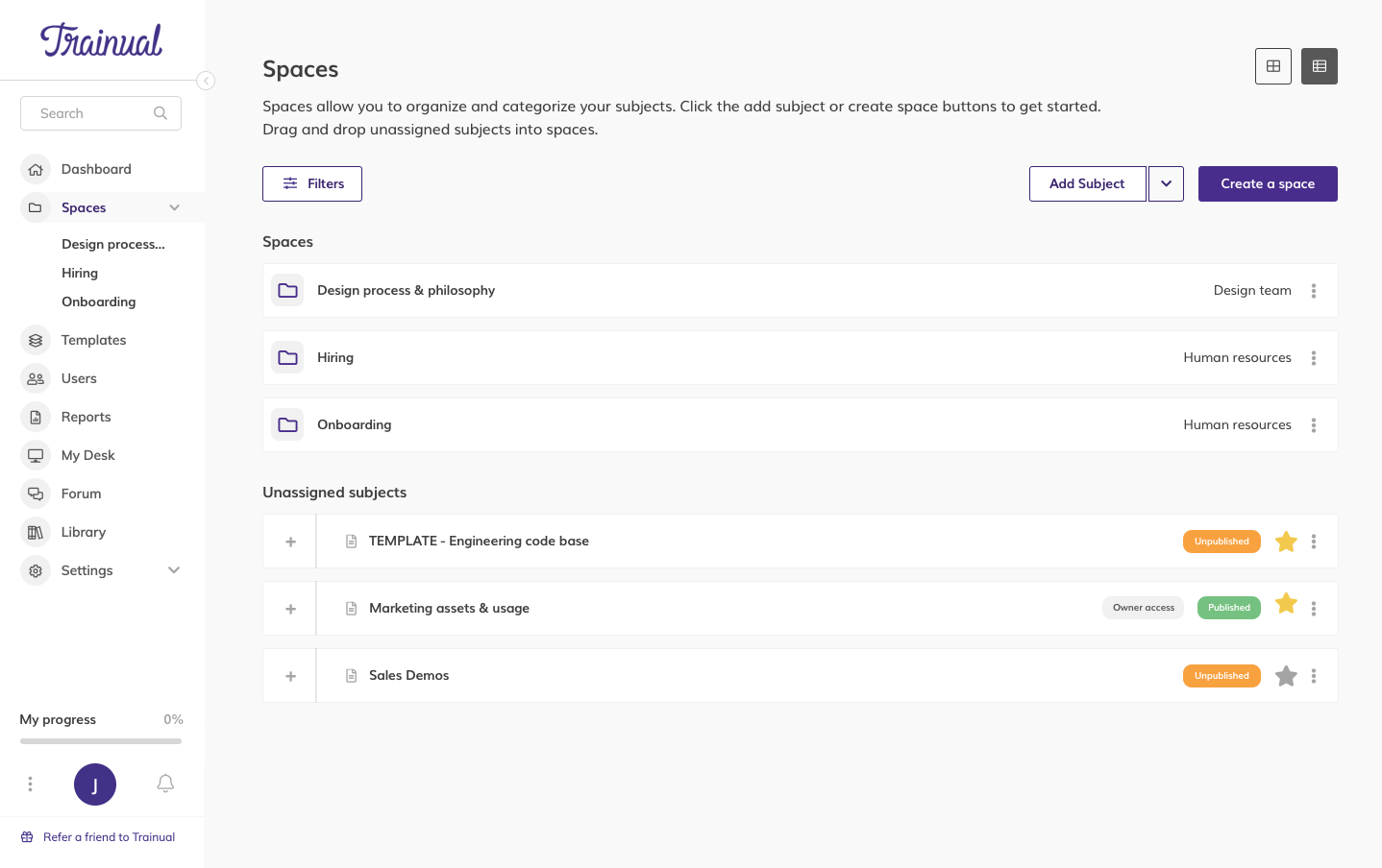
The spaces can be viewed in list view for quick and easy locating and searching

Easy space creation form

The space has children training categories within it for maximum organization
How I Led the Work
Defined the problem as a scalability challenge, not just a UI issue
Translated user pain points into clear design opportunities
Led iterative design and testing cycles
Balanced user needs with system and business constraints
Ensured alignment with the design system for long-term scalability
Solution
The redesigned experience introduced:
Clearer content structure and navigation
Tabs separating core types of content
Multi-layered structure (Space → Subjects → Training Content)
More flexible organization through tagging, filtering and search
Published or not
Date published
Date updated
Groups/teams assigned
Key word search
Improved visual hierarchy for faster scanning
Title, editing permissions, number assigned, category type
A scalable component system for future growth
The result was a catalog that could grow with customers instead of breaking under complexity.

Outcomes
Faster content discovery for users
Increased engagement with training content
Improved adoption of subject creation
Easier cr
Positive feedback from both content creators and learners
Most importantly:
The system now supports scale—rather than limiting it
What This Enables
Growth from small teams → large organizations
Better content management across departments
A foundation for future features (search, personalization, automation)
What This Demonstrates
Designing for scale, not just usability
Balancing structure and flexibility
Translating user pain into system-level solutions
Building solutions that support long-term product growth
Final Takeaway.
This wasn’t just a page redesign—it was a shift in how content is structured and managed.
By introducing flexible organization and designing for scale, I helped ensure Trainual could grow with its customers—without sacrificing usability.