From churn risk to enterprise-ready growth: How I directed Limble’s re-imagined mobile app experience and retained $165K+ ARR
Role: Product & Design Leadership
Scope: Re-imagined mobile app
Timeline: 10 months (research → release)
Impact: Retained $165K+ ARR and unlocked enterprise growth
Team and stakeholders: Product designer, Product Manager, Engineering Lead and engineers, VP Product, VP Engineering
Overview
Limble CMMS is a maintenance management software that helps teams keep track of equipment, repairs, and scheduled maintenance in one place. It makes it easier for companies to manage work orders, prevent breakdowns, and keep their assets running smoothly.
Its customers are maintenance and facility teams in industries like manufacturing, healthcare, schools, hotels, and logistics—anywhere equipment and buildings need regular care to stay working.
When I joined Limble, the legacy mobile experience (used by maintenance technicians) was putting revenue and customer trust at risk. A key segment was close to churning, and we were losing deals to competitors due to poor mobile performance.
I helped direct a cross-functional effort to stabilize the experience, rebuild the foundation, and reposition mobile as a competitive advantage.
The Situation
Mobile isn’t secondary in Limble—it’s how technicians do their jobs in the field.
When it fails:
Work orders don’t get completed
Data gets lost
Trust erodes quickly
At the same time, we were seeing clear competitive pressure:
Prospects preferred MaintainX (biggest competitor) in head-to-head trials
Customers were avoiding our mobile app entirely
Some technicians defaulted to using desktop in a mobile browser just to avoid crashes in mobile
The Problem
The issues weren’t isolated—they pointed to systemic breakdowns:
1. Unreliable Core Experience
Crashes, white screens, freezing mid-flow
Long load times and slow time-to-value
Sessions timing out with data loss
Critical workflows and high-value actions are deeply buried within the interface.
Inefficient and inconsistent interaction patterns force users to rely on workarounds.
2. Failure at Scale
Large datasets caused cache failures
Enterprise customers had the worst experience
3. Broken Offline Mode
Offline prep could crash the app
Sync failures risked permanent data loss
Critical instructions became unusable
4. Product Perception Risk
$13.6K MRR tied to poor experience
$2.3K MRR already lost in recent deals
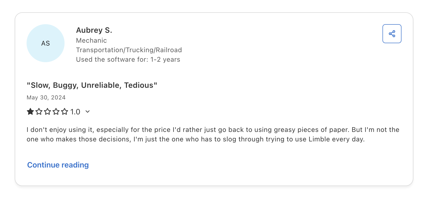
Repeated feedback: competitor mobile was “better”
Why This Was Hard
This wasn’t a bug-fixing problem—it was a system-level challenge:
Legacy architecture constraints (data load limitations, unstable caching)
High-stakes users (technicians under pressure, often offline without service and wifi
Business urgency (active churn + blocked enterprise growth)
Fixing surface issues wouldn’t be enough—we needed to rebuild the foundation while customers were actively using the product.
Strategy
We aligned around a clear hypothesis:
If we provide a simple, and stable mobile app, we increase technician efficiency, reduce churn, and unlock enterprise growth.
This led to three strategic priorities:
Ship quickly to address churn risk
Rebuild the foundation (not patch the legacy system)
Design for real technicians in the field conditions
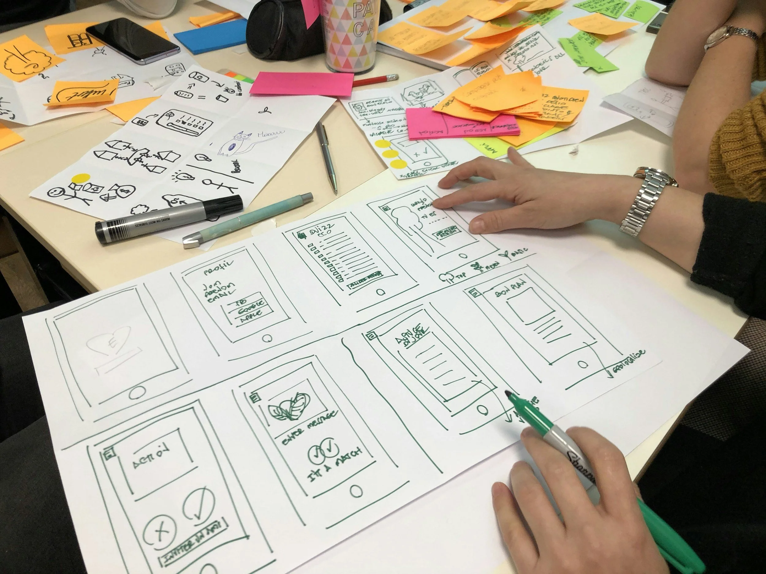
We (Design, Product and Engineering) visited our customers in the field to understand their environment and biggest pain points, and re-design the new mobile app with them

Key Decisions
1. Rebuild Instead of Incrementally Fixing Legacy
We chose to build a new React Native app rather than continue patching the legacy system.
Why: Recurring failures pointed to architectural limits, not isolated bugs
Tradeoff: Higher upfront cost, but long-term scalability and reliability
2. Prioritize Stability Over Feature Expansion
We focused MVP on reliability and core technician workflows—not feature breadth.
Why: Technicians couldn’t use the app consistently—nothing else mattered
Tradeoff: Delayed less-critical features (e.g., manager workflows)
3. Design for Technicians, Not Assumptions
We grounded the experience in real field conditions through onsite research.
What we learned:
Non-native English speakers
Constant movement between job sites
Harsh environments (lighting, noise, distractions)
Frequent offline scenarios
Accessibility challenges (zoom, readability)
This shifted the product from “mobile app” → field tool
4. Build Design System + Product in Parallel
We created a mobile design system while building the app.
Why: Consistent and standard patterns, accessibility, and scalability were required immediately
Tradeoff: Added more coordination and headcount, but prevented long-term debt and re-work
How we shaped the work
I focused on creating clarity across a complex, high-pressure problem:
Translated scattered usability issues into clear system-level problem areas
Example: Serving the deeply hidden yet critical tasks up to the homescreen
Aligned engineering, product, and leadership around shared priorities
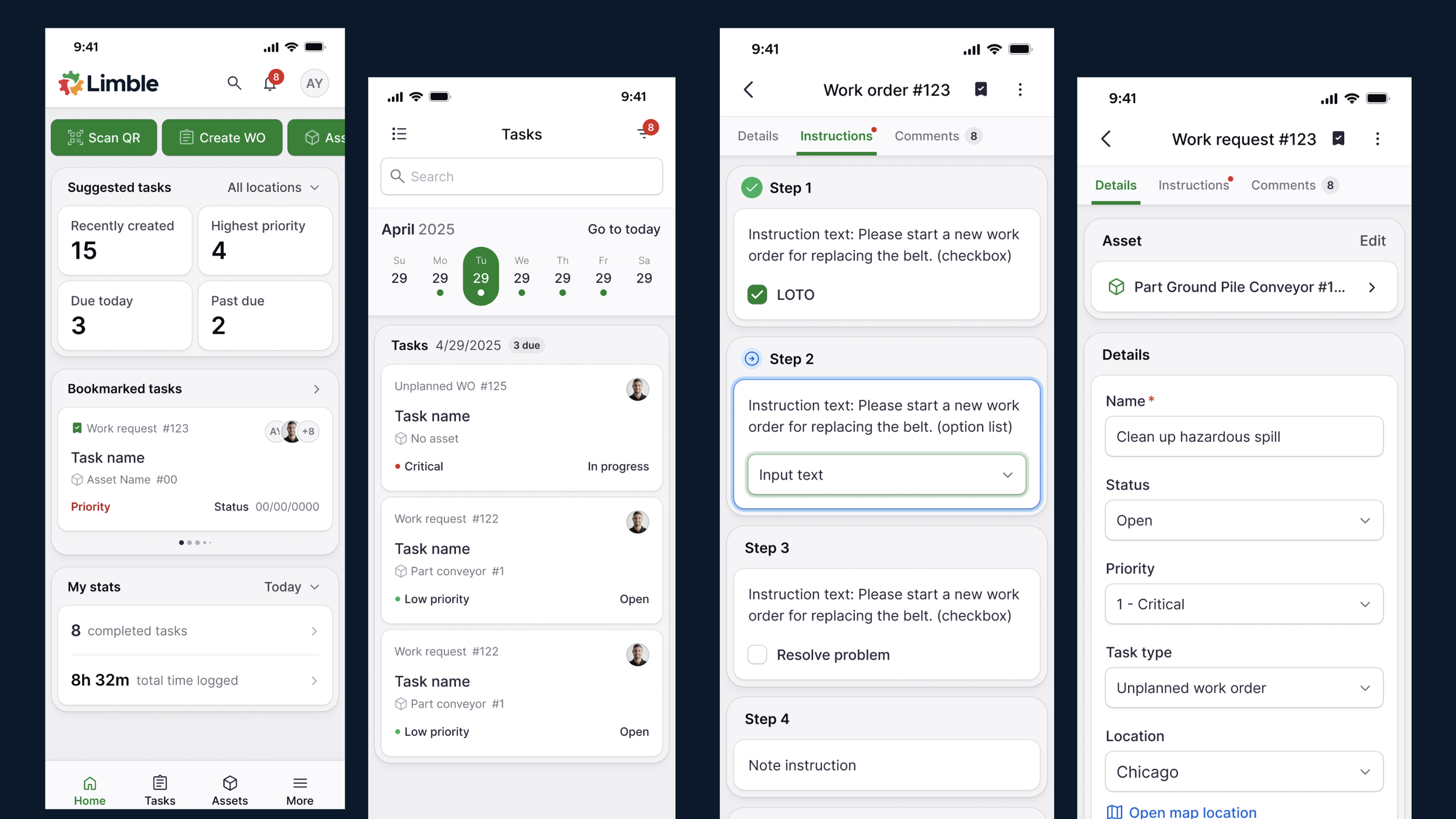
Cohesive and accessible UI (Design System); Frictionless Navigation (New IA)
Prioritized based on user impact + business risk
Critical technician jobs-to-be-done, usability and stability prioritize before manager jobs to be done
We shifted from reactive debugging → structured, strategic execution.
Solution Approach
We organized the product around technician jobs-to-be-done:
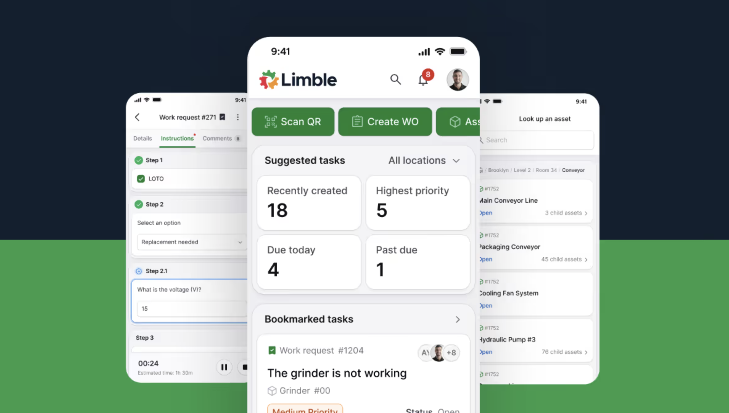
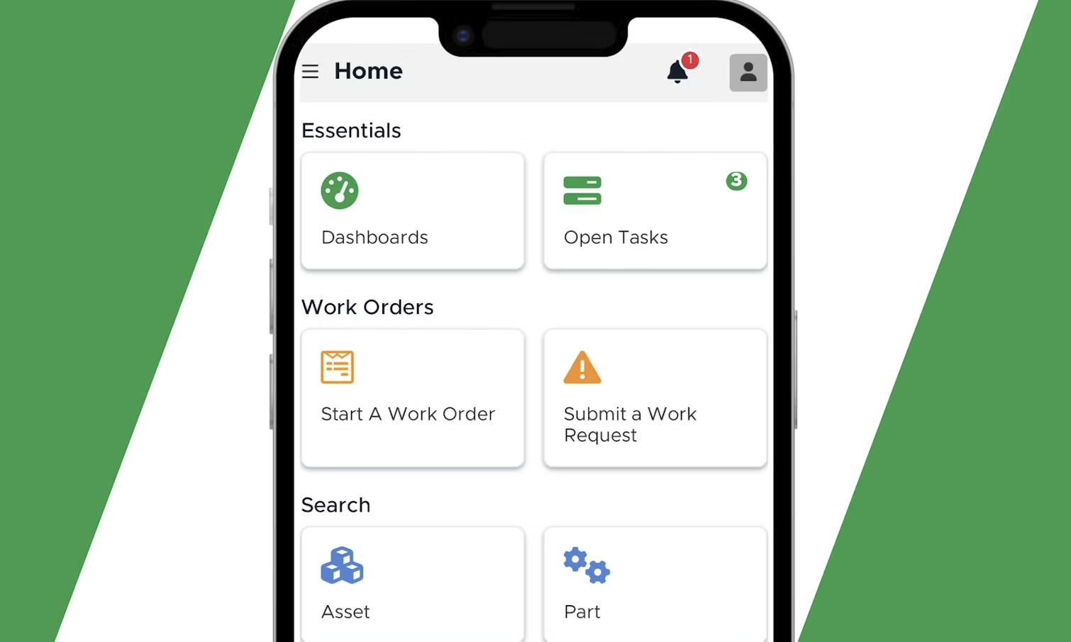
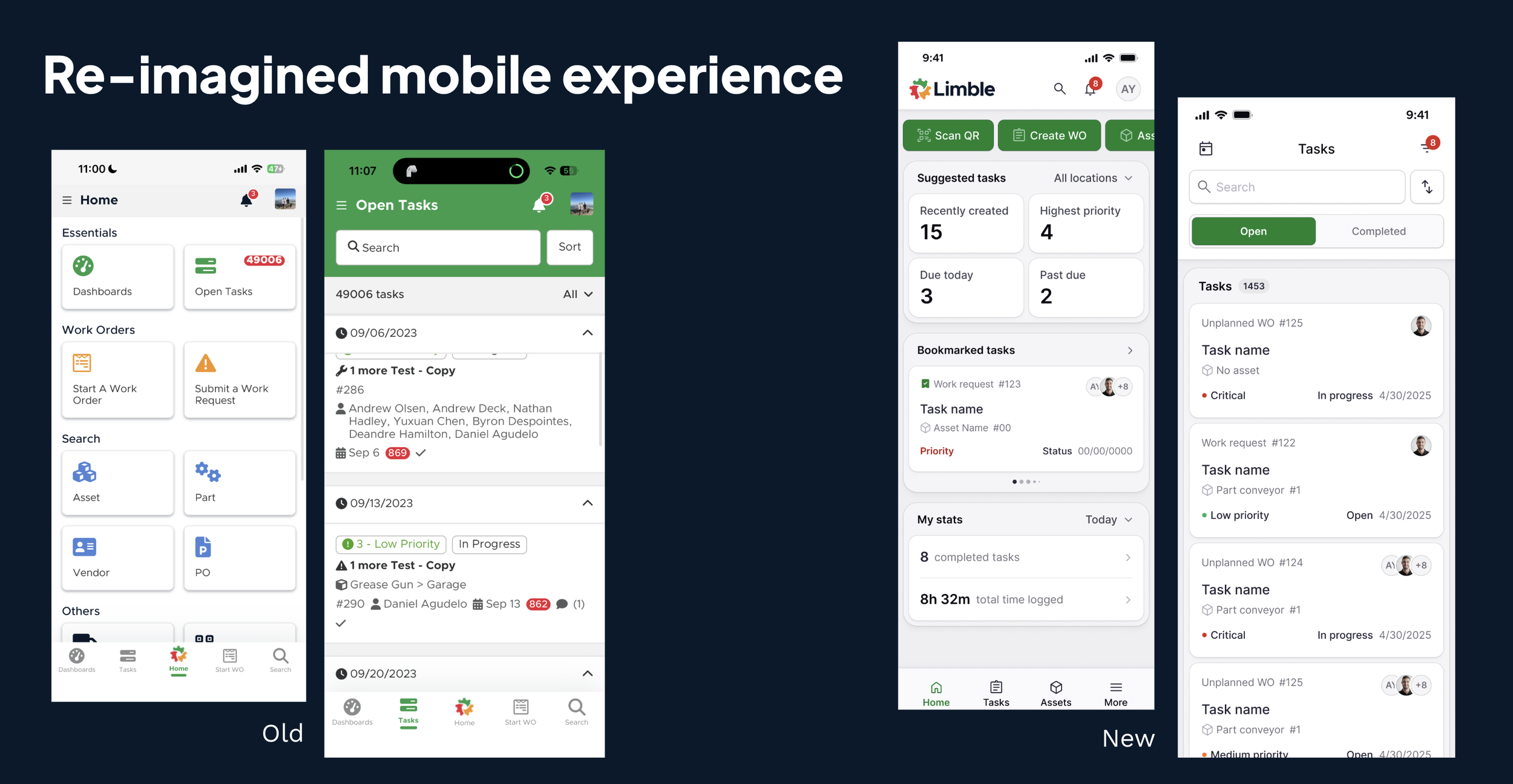
Find critical tasks quickly → improved home screen lists, filtering, bookmarking
Access historical data easily → better visibility into past work
Understand assets fast → clearer, more usable detail views
Navigate efficiently → simplified flows, most common actions are discoverable and a tap a way
We explicitly kept MVP focused by saying no to:
Non-essential workflows (manager jobs-to-be-done)
Features not critical to core value
Outcomes
We didn’t just fix the experience—we exceeded every success metric:
99% crash-free sessions (target: 90%)
96% error-free sessions
95% weekly active user retention (target: 85%)
4.8 app rating (from ~4.2 baseline)
Session time reduced from 33 → 11 minutes
Due to load time decreasing
Less time navigating
Business impact:
Retained $165K+ ARR
Protected $36.8K MRR tied to offline capability
Removed a major blocker in enterprise deals
Most importantly:
Technicians trust the app again
Mobile is now a selling point—not a liability
What This Enabled
By stabilizing and rebuilding mobile, we unlocked:
Ability to pursue enterprise customers 3x larger
Stronger competitive positioning in sales
A scalable foundation for future mobile investment
What This Demonstrates
Leading through high-risk, high-ambiguity situations
Making system-level decisions, not surface fixes
Balancing speed vs. long-term architecture
Translating user reality into product strategy
Driving alignment across teams under pressure
Re-imagined Mobile app feedback
“We’ve piloted the new mobile app with 18 of our most complex technicians, and the difference in speed and reliability has been huge. Honestly, the lack of complaints says a lot. Even one of our biggest critics is starting to come around — he’s already noticing the improvements.”
- Current Customer
“Our technicians love the new task format — especially how the sections are separated and the larger font size. It’s much easier to read and navigate.”
- Current Customer
“For a long time, our biggest sticking point was the mobile experience in the field — especially with unreliable connectivity causing timers to stop and users to get kicked out. But the new app is already a clear improvement. We like it so much better.”
- Current customer
Final Takeaway
This wasn’t just a redesign—it was a business-critical intervention.
We transformed mobile from a churn driver into a competitive advantage and growth enabler